

Cold Pressed Juice visual identity & packaging design
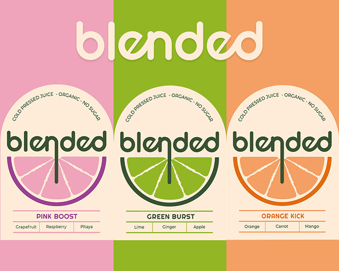
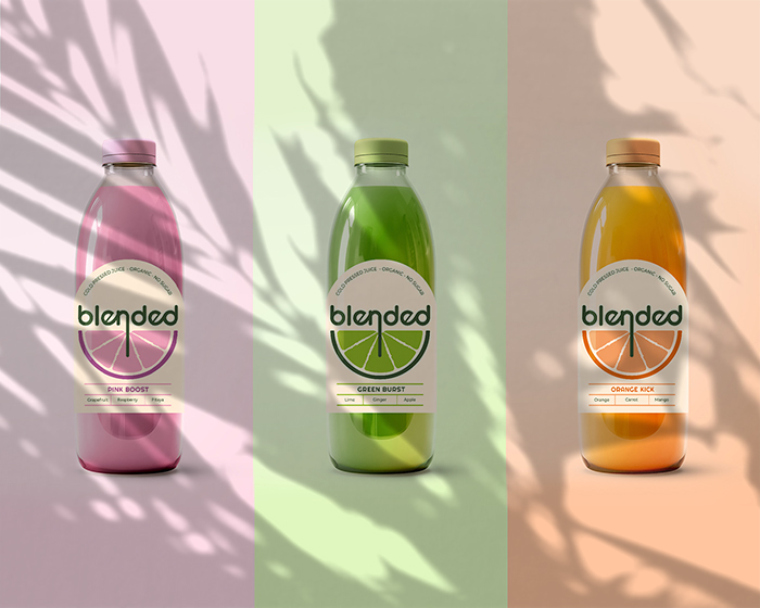
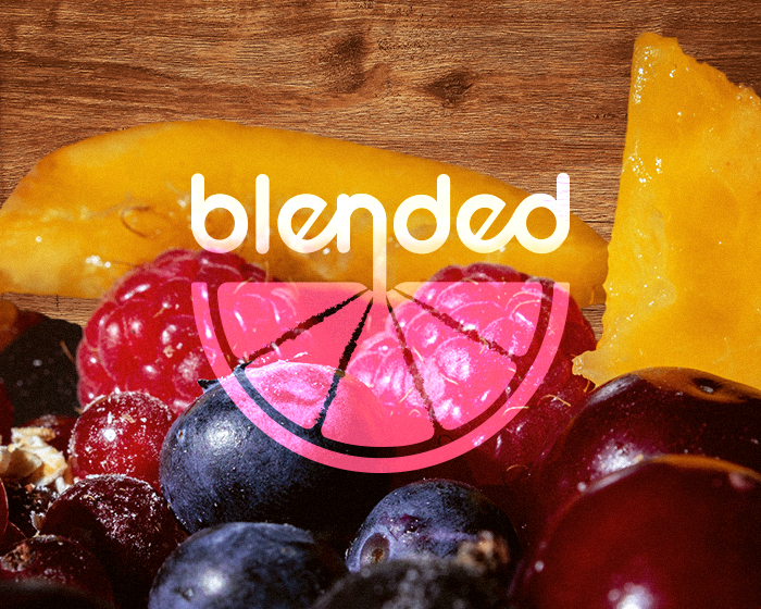
Blended is an organic cold-pressed juice & smoothie company targeting Millenials and Gen Z. Their tagline is “Make healthy tasty and easy for those with a busy life!”. Blended mixes fresh fruits in an original combination just for you, the busy one. Their products do not contain added sugar or sweeteners, you’ll enjoy the pure taste of nature. Their products aimed at people who live an active and healthy life will be available as refreshing and energetic cold-pressed juices and smoothies, in three main flavors: Pink Boost, Green Burst, and Orange Kick!
Design solution: A playful, modern, minimal, bright, friendly, fresh, approachable, bold, energetic, and cool visual identity and label design for the three flavours, meant to make the brand stand out in the crowd.
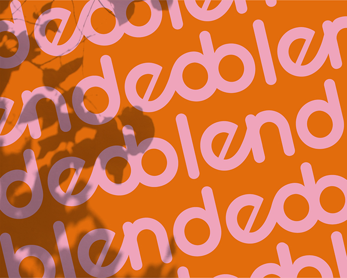
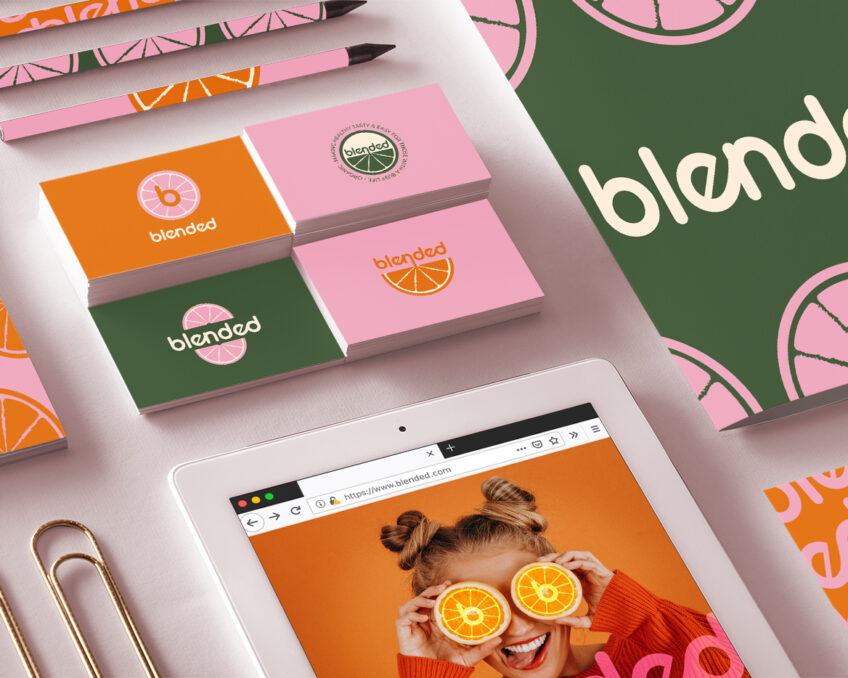
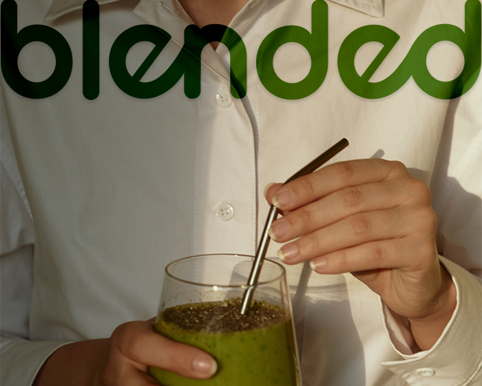
For the primary logo, the logotype, I edited the letters so that both “e” could properly tie with “n” & “d”, underling the brand name – Blended. I rounded the corners for a smooth, dynamic, friendly, and modern tone of voice.
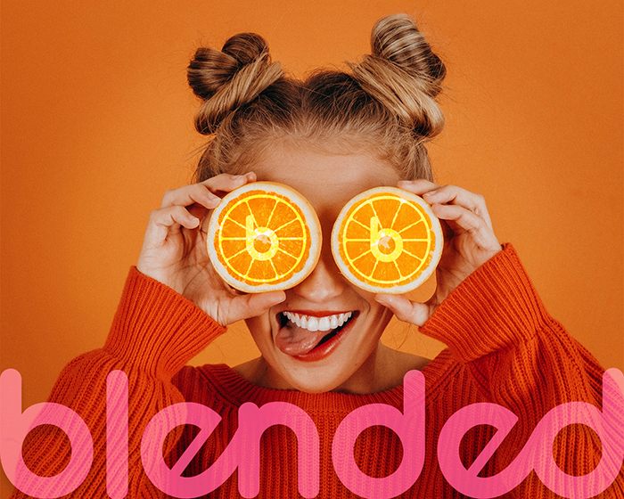
In the secondary logo, the main logotype is placed on top of a citrus slice, the letter’s arm descending into the fruit, as a straw in a glass full of vitamins. The secondary logo is repeated in the logomark and for the bottle label designs to create a cohesive brand image.
For the circular submark logo, the initial of Blended placed on top of a citrus full slice, being surrounded by the company’s motto: Make healthy tasty and easy for those with a busy life – Organic.
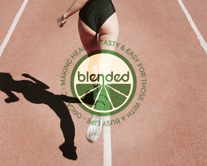
The circular logo mark features the secondary logo surrounded by a circle and the company’s motto: Make healthy tasty and easy for those with a busy life – Organic. The circle is a symbol of protection, friendship, and unity, values that the brand promotes.
Brand identity and packaging design passion project created in Adobe Illustrator on Wacom Cintiq 16.