

Tea visual identity & packaging design
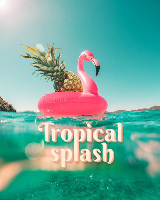
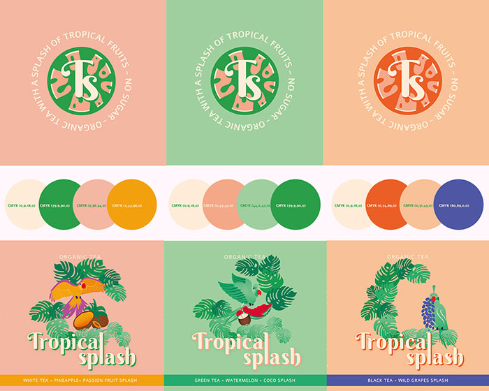
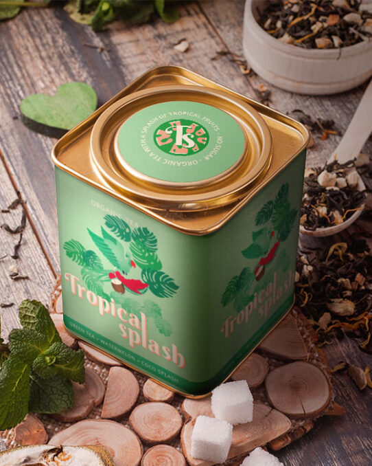
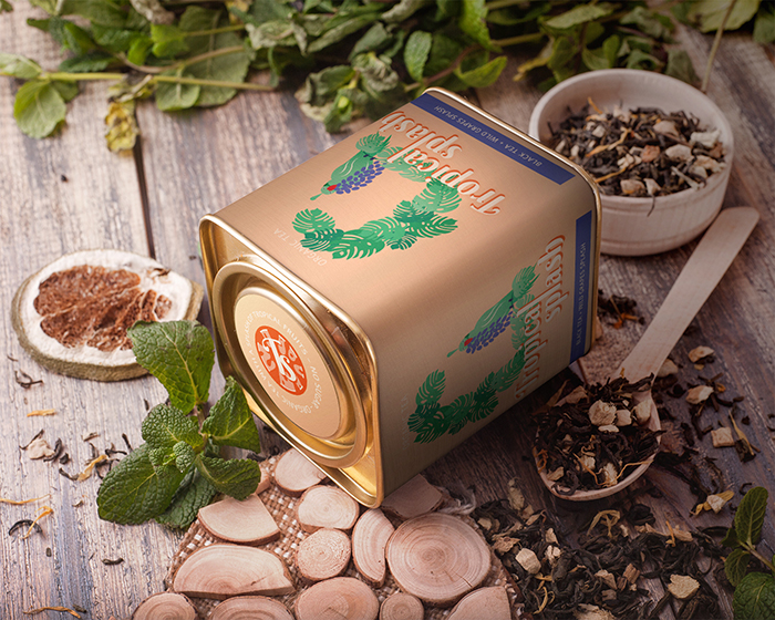
Tropical splash is an organic tea company targeting Millenial and Gen Z, whose motto is “Organic tea with a splash of tropical fruits”. Their products do not contain added sugar or sweeteners, they focus only on the natural taste of the fruits mixed with tea. Their tropical tea aimed at women who live an active and healthy life will be available as a refreshing and energetic beverage perfect for the hot summer days and as a rich mix for a Tisana at home, in three tropical flavors: Green tea & watermelon & coco splash, White tea & pineapple & passion fruit splash and Black tea & while grapes splash!
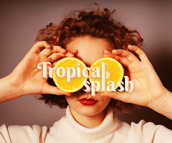
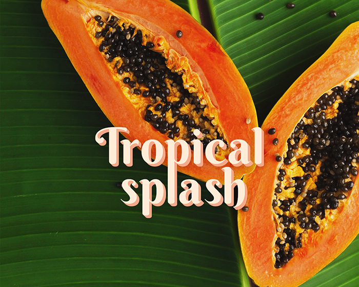
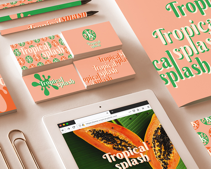
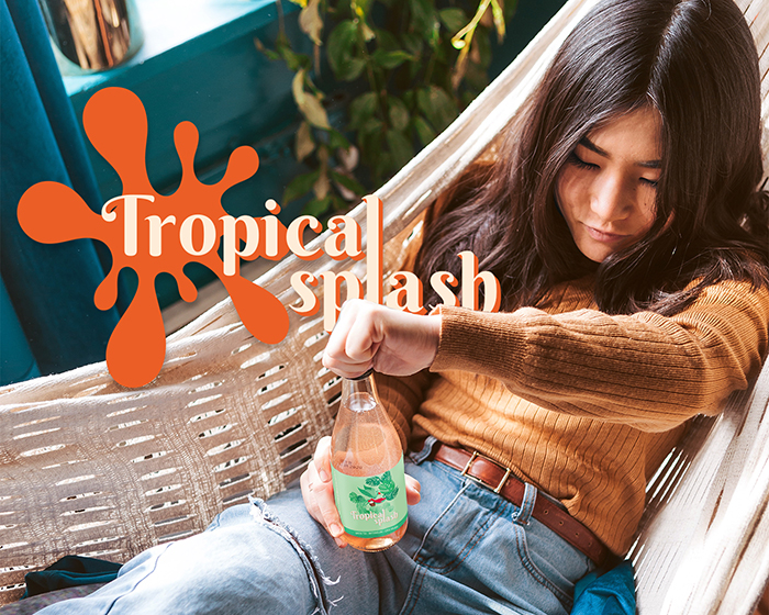
Design solution: A playful, modern, feminine, bright, friendly, fresh, approachable, boho, bold, energetic, cool, tropical brand visual identity and packaging design that makes the brand stand out on the shelves, by using colourful tropical illustrations.
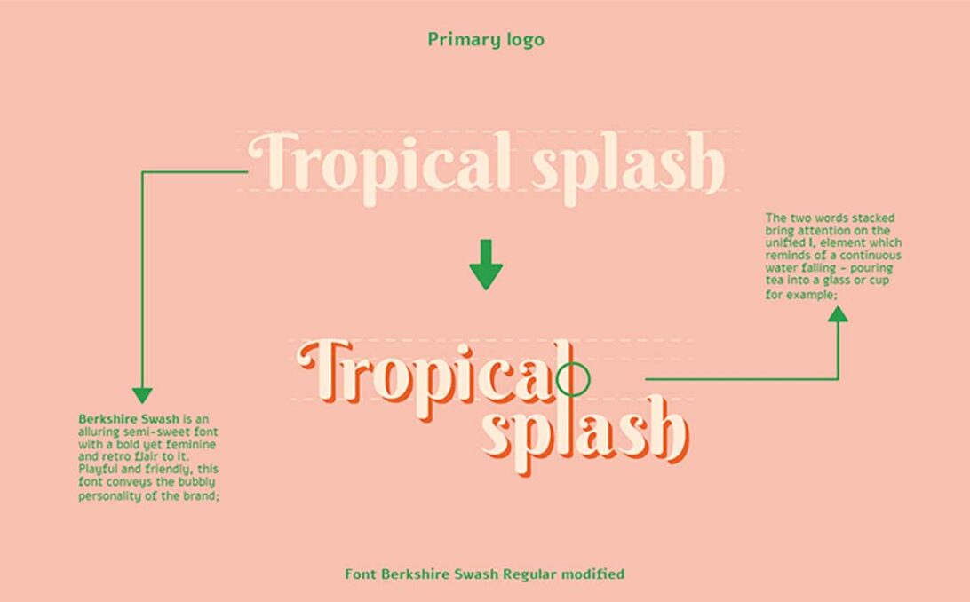
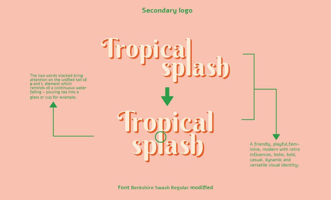
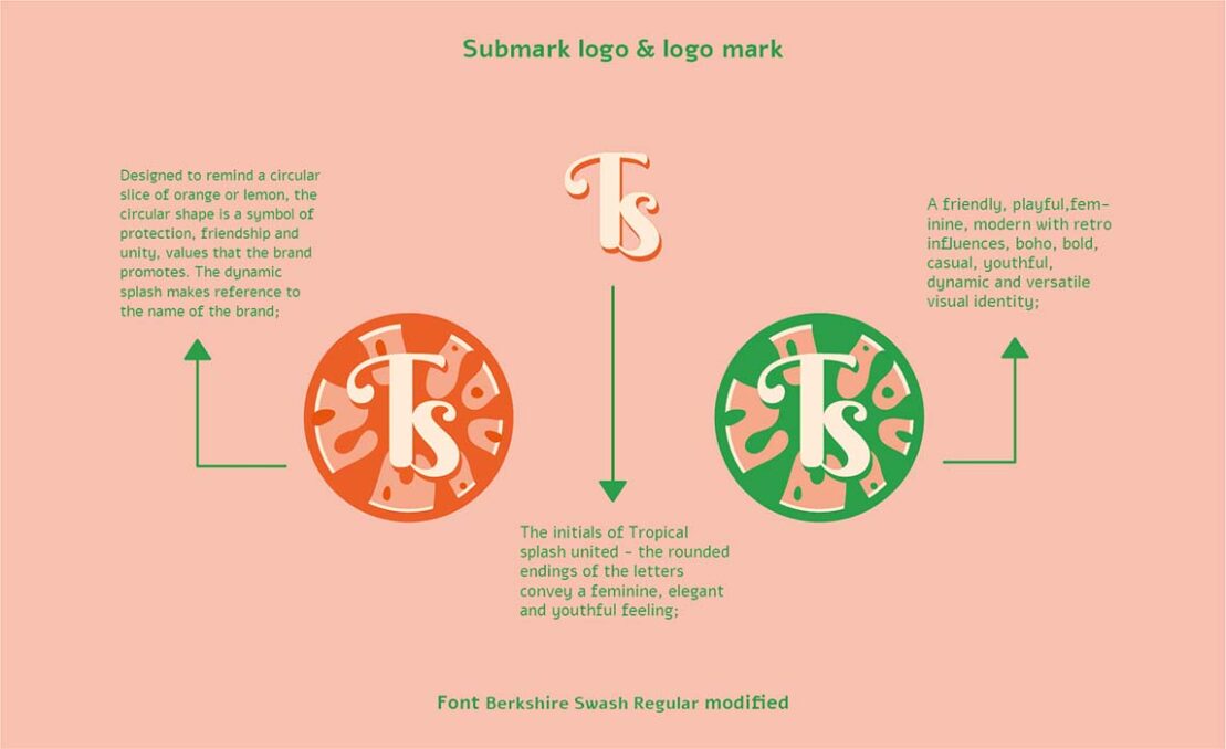
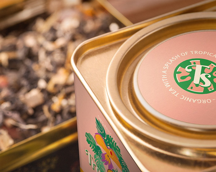
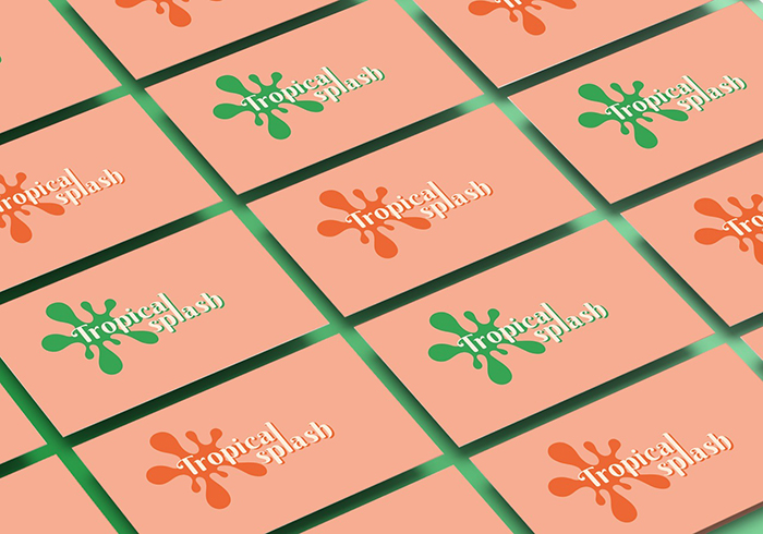
In the primary logo, the two words stacked draw attention to the unified l, an element that reminds of continuous water falling – pouring tea into a glass or cup for example. In the secondary logo, the two words highlight the unified tail of p and l, an element which reminds of continuous water falling – pouring tea into a glass or cup for example. For the submark logo, the initials of Tropical splash united convey a feminine, elegant, and youthful feeling, thanks to the rounded endings of the font. The circular logo mark is designed to remind a circular slice of orange or lemon. The circle is a symbol of protection, friendship, and unity, values that the brand promotes. The dynamic splash makes reference to the name of the brand – Tropical splash.
The illustrations on the package are inspired by the chromatic richness of tropical flora and fauna. Each flavor has its own unique illustration inspired by the ingredients used.
Brand visual identity and packaging design project created in Adobe Illustrator on Wacom Cintiq 16.