

Skincare brand identity & packaging design
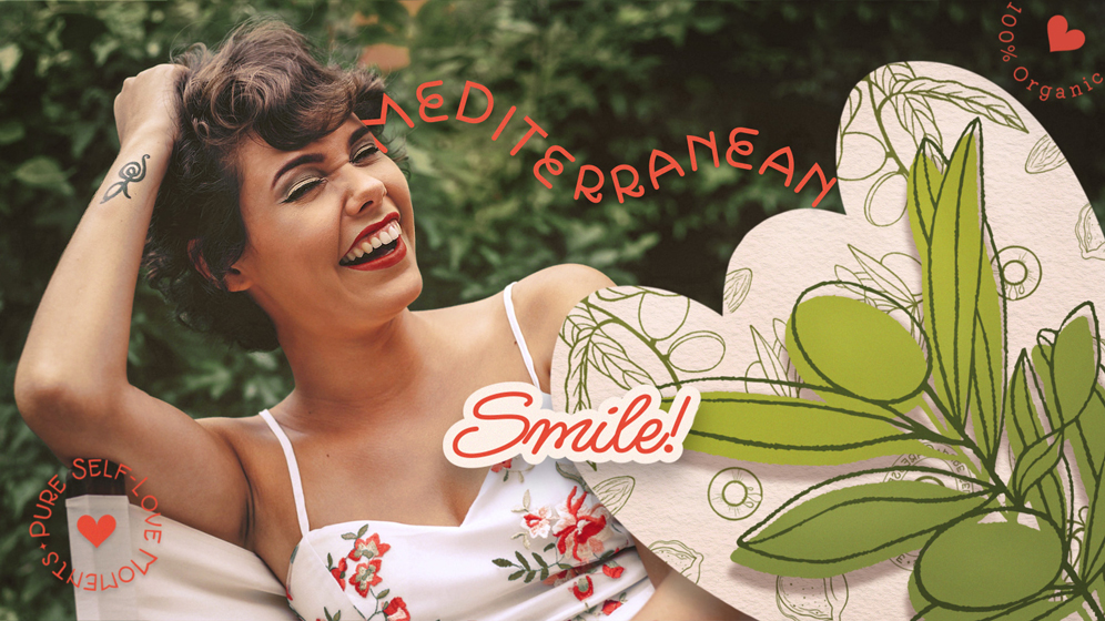
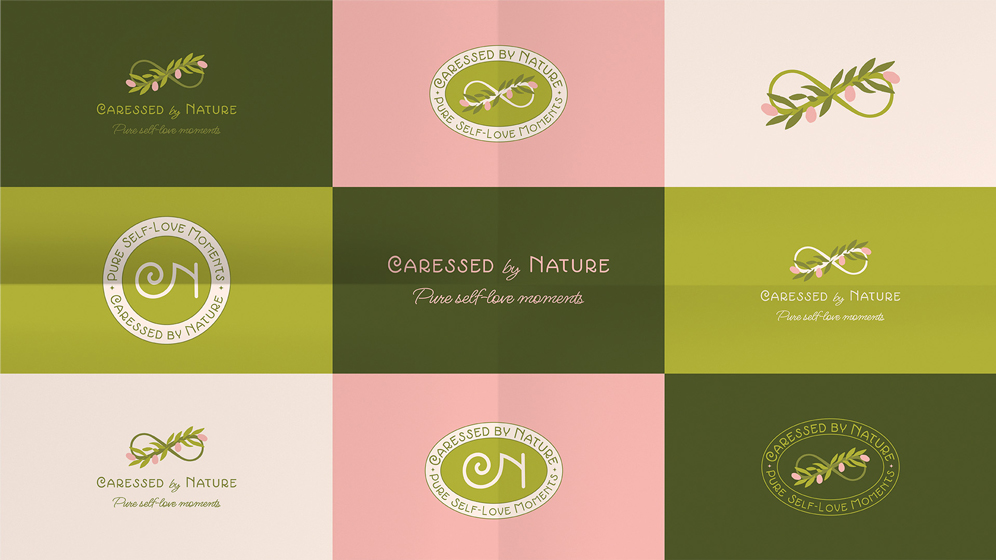
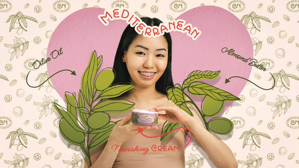
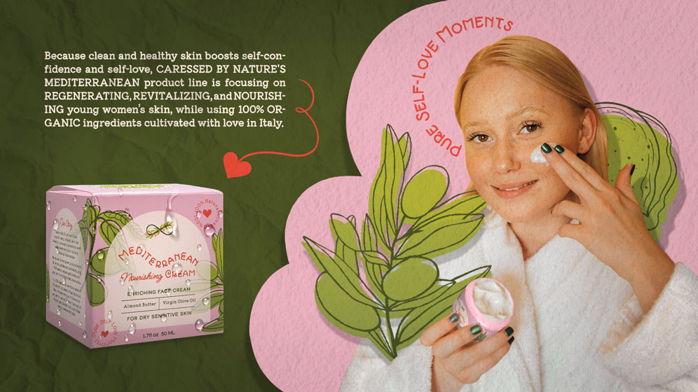
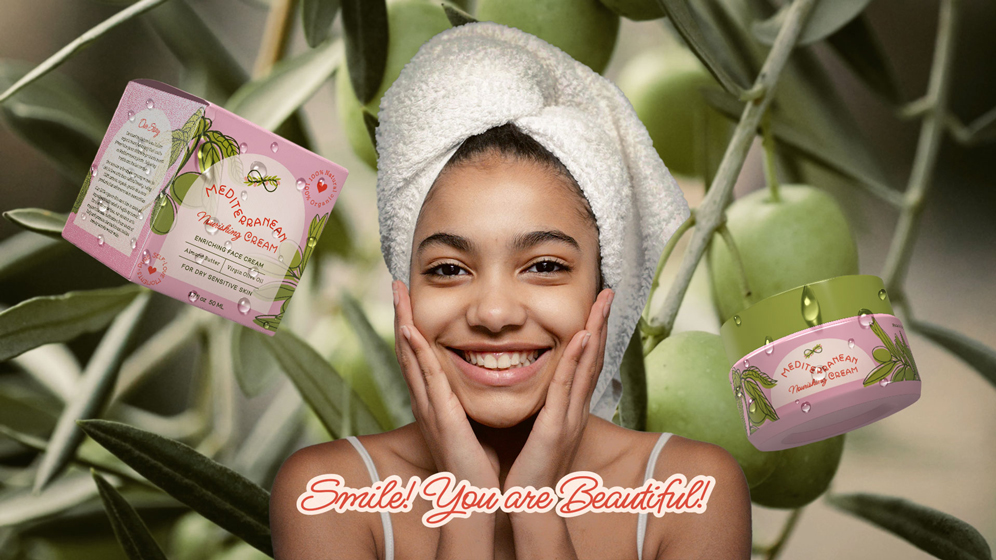
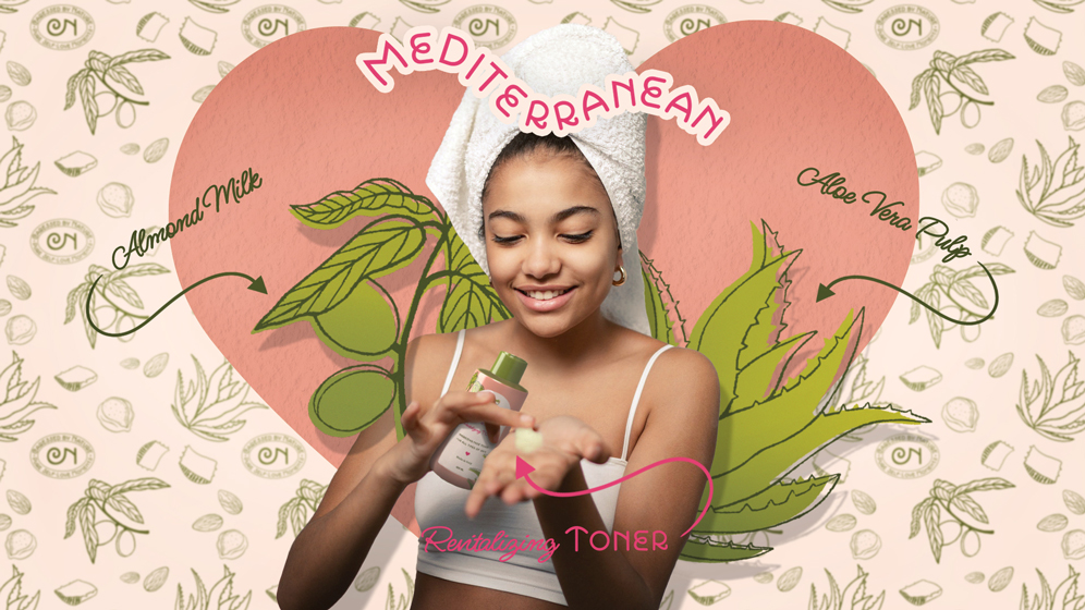
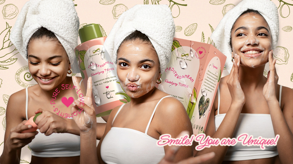
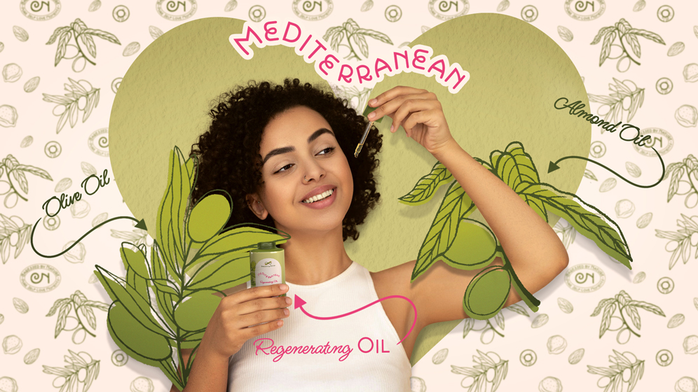
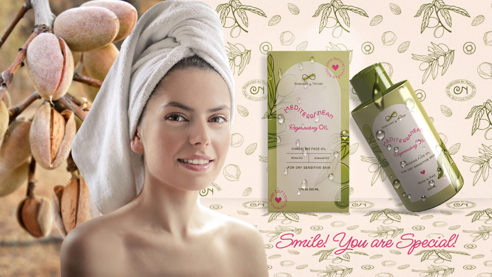
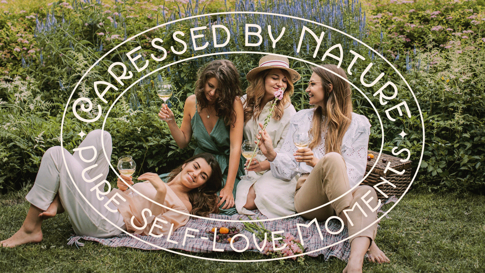
Meet Caressed by Nature, an Italian organic beauty company that crafts 100% powerful organic skincare products for Millennial and Gen Z women worldwide! Their products are based on Mediterranean plants cultivated by locals in Apuglia, south of Italy. Brand tagline: Pure self-love moments.
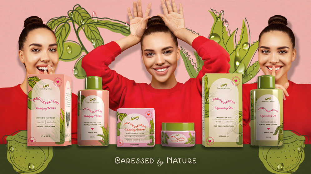
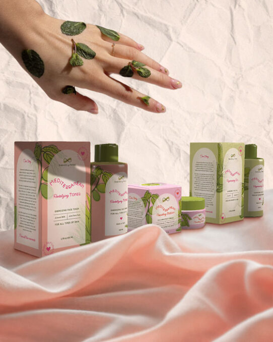
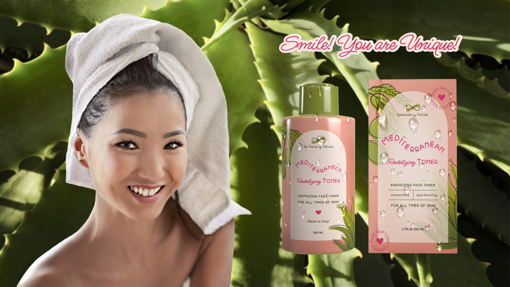
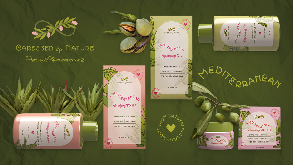
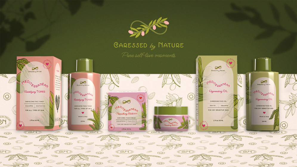
Brand Objectives: To create a strategic brand identity system and three product packaging designs for their Mediterranean Regenerating Oil, Mediterranean Revitalizing Toner, and Mediterranean Nourishing Cream that will help build brand awareness and make the brand stand out among competitors.
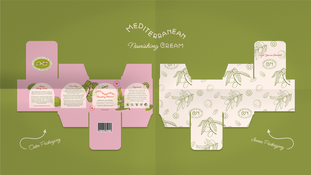
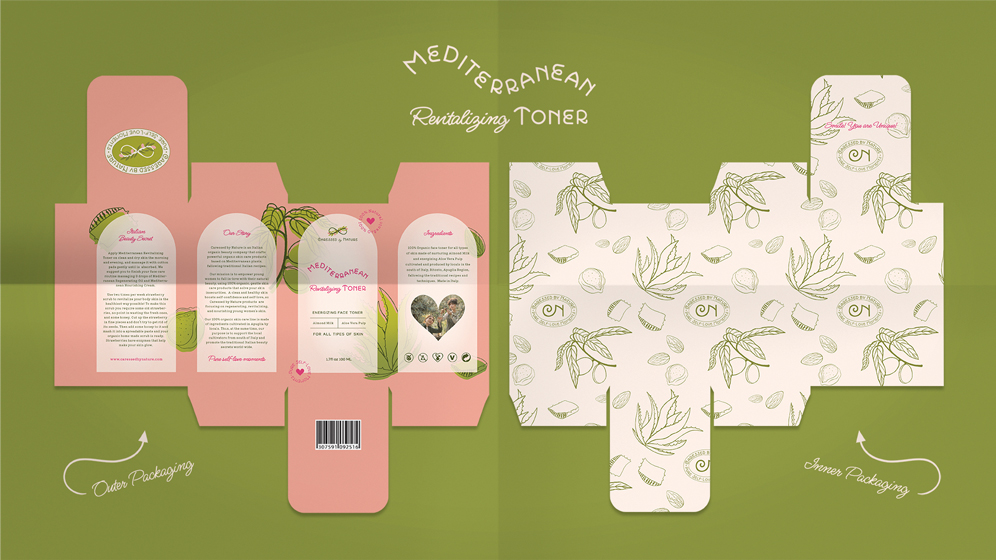
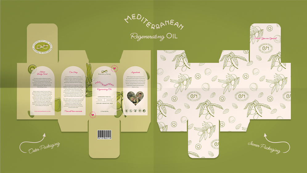
Design Solution: Based on the Top Competitor Research and Customer Persona, I’ve discovered that most of the organic skincare brands tend to have a luxury or medicinal feel, and their product packaging design is focused on typography. As one of Caressed by Nature’s objectives is to stand out in the crowd, I integrated youthful line art illustrations mixed with offset gradients depicting the organic ingredients used on the packaging to establish trust within the brand and its genuine values.
Having in mind the brand’s strategic and creative directions, I’ve selected for the visual identity and packaging design two quirky sans serifs mixed with a casual script as primary and secondary fonts, and a simple sans serif plus a slab serif as complimentary fonts, which I customised to better fit the youthfulness and the caring nature of the brand.
The general concept for the logo mark is inspired by the brand’s mission, purpose, and core values – the infinite care of the brand for its target customer and nature, by using only organic ingredients, cultivated with love. The product line name, Mediterranean, is shaped as a wave to remind the target customer of nature and the location where the organic products are cultivated.
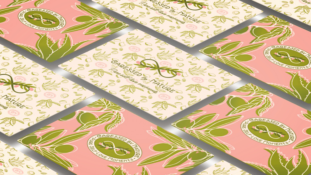
To enhance brand awareness, differentiate the product varieties and create an exciting customer experience while opening the packaging, I used inside the boxes the brand pattern in three distinct variations depicting the submark logo and the illustrations of the ingredients used for each skincare product, plus a unique motivational beauty quote under the top panel flap meant to empower women to love themselves just as they are.
Following the creative direction, the brand identity uses tones of warm green inspired by the ingredients used, to suggest brand values such as organic, natural, healthiness, freshness, eco-friendly, safety, and harmony, warm pastel pinks to create a youthful, playful, feminine, and innocent feeling within the brand, and a warm off-white to suggest safety, purity and to create contrast.
This personal project was created in Adobe Illustrator, Adobe Photoshop, and Adobe Dimension, and I invite you to watch my entire brand strategy and design process in the videos below, on my YouTube channel!