

Bakery rebranding & packaging design
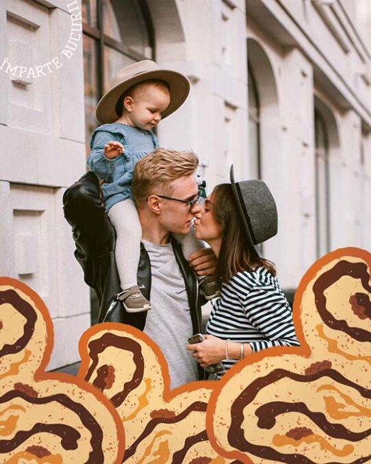
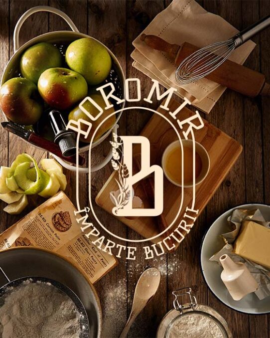
Rebranding and packaging design passion project created for Boromir, an important Romanian bakery that focuses on creating traditional and delicious sweet swirl bread, pretzels, and other pastry specialties loved by Romanian customers. Their tagline is “Share joy”.
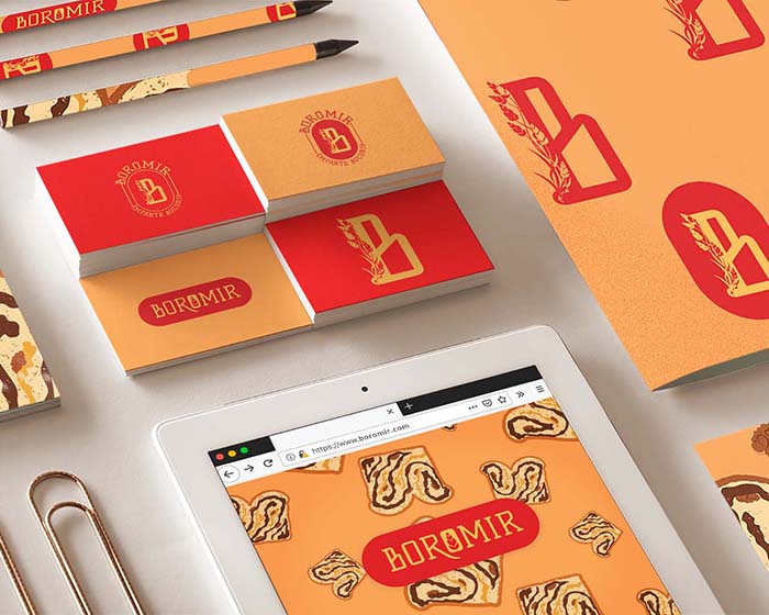
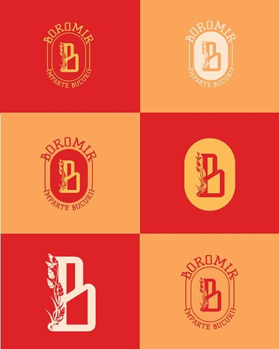
Because this is a rebranding project, I didn’t want to create a whole new visual direction for the brand, so I kept some attributes of their old logo known by customers, such as the colours, the vintage vibe of the font, and the oval shape for the logotype. Following their brand personality, traditional, organic, vintage, happy, and feminine, I redesigned their visual identity and packaging in a more playful and modern, yet stylish manner aimed to target younger female customers.
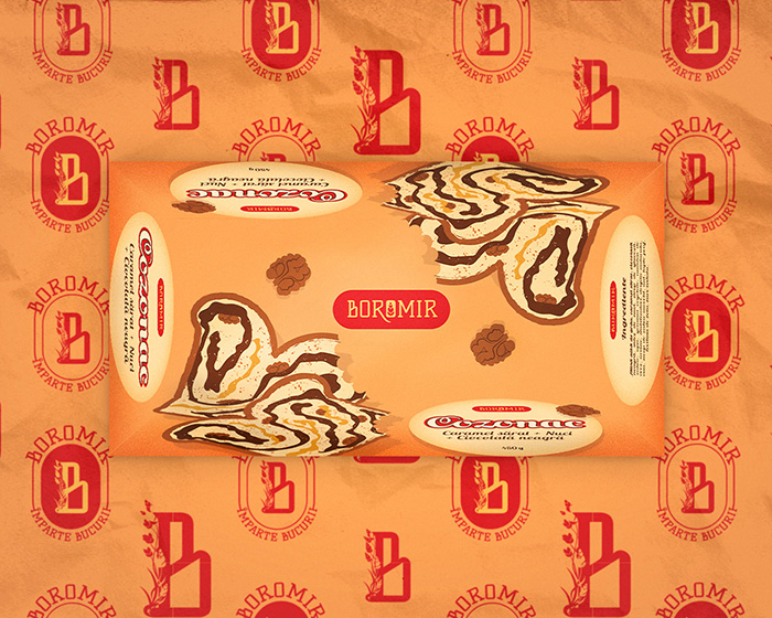
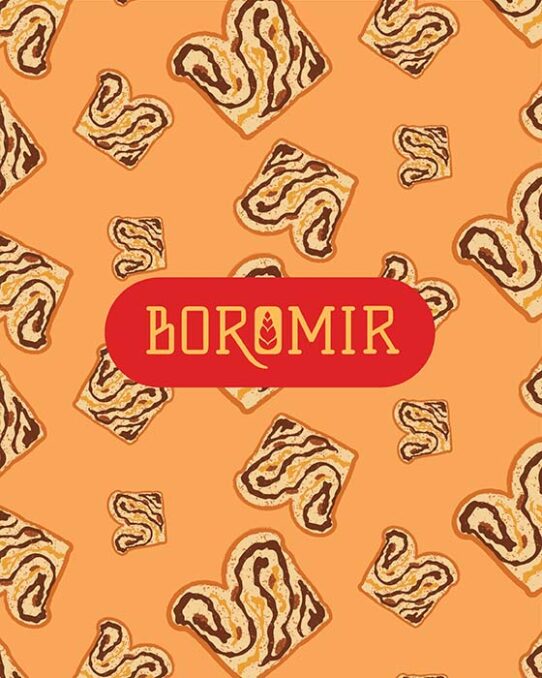
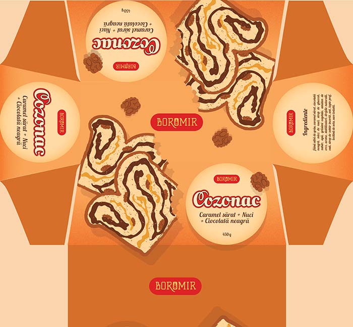
Thus, for the sweet swirl bread packaging, I chose to use custom vector illustrations instead of photos featuring the products, the package having a completely different look, more modern and playful but keeping the vintage and artisan influence characteristic of the brand. So instead of pictures, I illustrated slices of sweet swirl bread and nuts, which indicate the filling of the product.
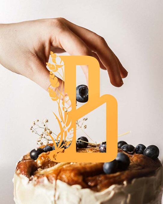
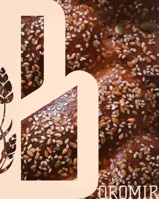
For the logotype, I chose a slab serif font custom modified to draw the eye towards the center of the word Boromir – the letters Ro stands for Romania and the traditional Romanian bakery products. For the logomark and primary logo, the initial B of the brand was mixed with a custom vector illustration of crops, the main ingredient used in bakeries. The artisan feeling of the font blends so well with the elegance of the curved lines of the illustration, aiming to add a more feminine and gracious touch to the visual identity.
This personal project was created in Adobe Illustrator and Adobe Photoshop.