


Bakery visual identity design
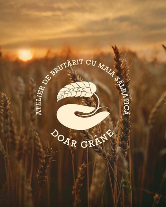
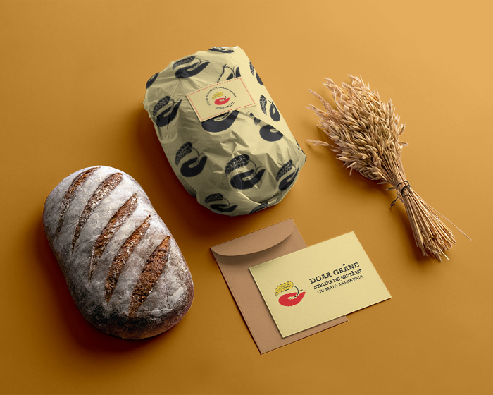
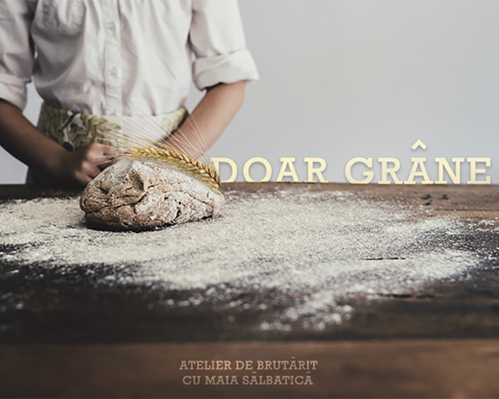
Doar grane (Only grains) is a Romanian bakery built in Bucharest by two engineers in love with bread and its entire creation process. DOAR GRÂNE promotes artisanal products with wild yeast, baked only with natural ingredients and without additives, targeting Millenials. Their business is focused on the creation and sale of baked products suitable for a healthy and natural diet.
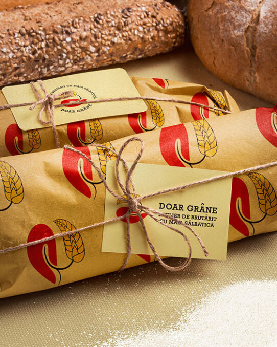
Design solution: A professional, serious but approachable, and artisanal visual identity design that expresses their brand values: healthy and natural panification products created for the community, using reinvented traditional techniques.
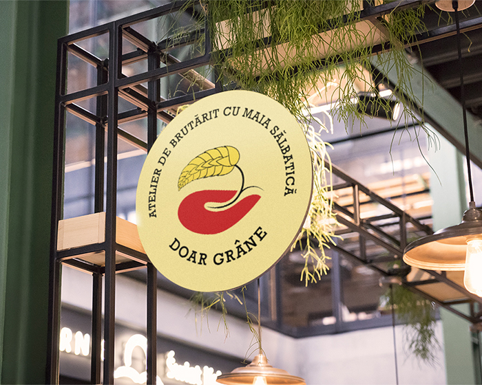
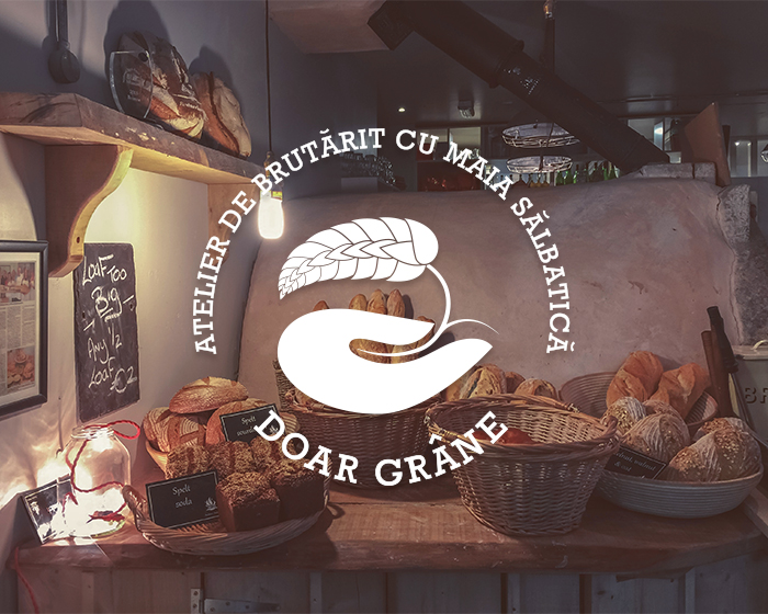
The hand is a universal symbol of protection and creation, as the dough is kneaded with the hands. Its representation is stylized, modern, and feminine, taking into account that women are the main customers of the brand. It suggests the mother’s hand, the hand that mixes the dough.
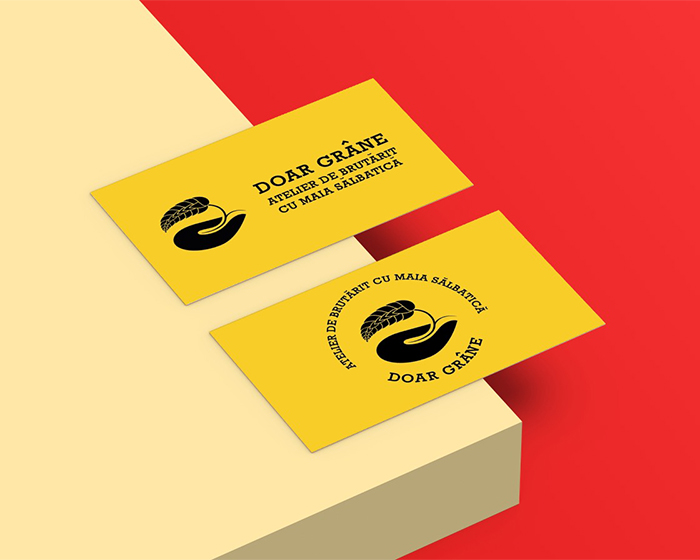
The logo is designed as a rounded artisanal stamp, the circle is the shape with the greatest positive impact on the human psyche, while also capturing consumers’ attention easily. The circle symbolizes perfection (emphasizes the attribute of professionalism), community, love, protection (emphasizes the attribute of healthy, natural), and unity.
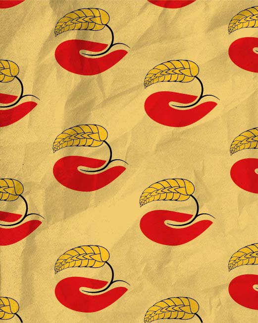
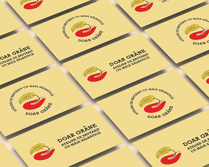
A slab serif was perfect to emphasize the artisanal aspect of the business. Based on food industry market research, I chose a warm color palette. Red and yellow are colors that stimulate the appetite, therefore they are adapted for use in creating the visual identity of a bakery.
Brand visual identity design project created in Adobe Illustrator.
High professionalism, attention to detail, and customer-oriented. Her creative mind gave life to what I wanted. I loved working with her on the brand identity design for my bakery Doar Grâne.